
Change Column Order On Mobile For Avada Theme
What is Avada ?
Avada is a powerful and popular WordPress theme used by Freelancers, Website Owners, Web Development companies to create websites. I have personally used Avada theme extensively and made quite a few sites using it. In fact, our own company website also uses Avada.
Creating Pages Using Avada
One of the reasons behind popularity of Avada is that it provides section builder in backend to users to make individual pages , posts, portfolio etc easily. The Fusion Builder ( avada section builder ) helps you create pages easily. Just like Elementor, it has lots of blocks available to be added to your section ( Text block, Heading block, CTA block, Image block etc ) . Container sections lets you organize these blocks in different columns as per your requirement. For e.g. 1/2 + 1/2 container divides the section into two equal columns etc.
Avada features Fusion Builder Live as well now. This is similar to elementor and lets you create pages / posts in front end. You can add edit blocks from front end and add various blocks in an easy WYSIWYG format.
Column Ordering in Avada
Columns are ordered in the same manner as they are created – i.e. The column that is first in the builder will be displayed first , while column that comes after will be redered later. This functionality is perfect – as that is what’s required by us to display.
Why Change Column Order / Reverse Column Order on Mobile For Avada?
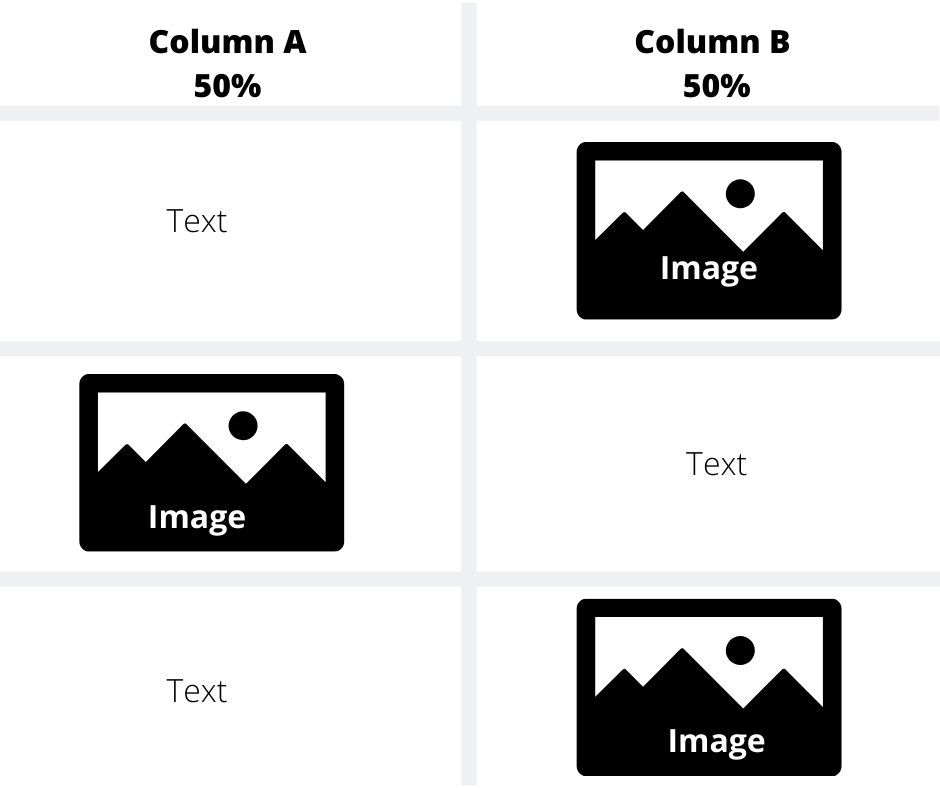
However the problem arises when you are planning to show images alternatively in different columns as per the screenshot attached.
Layout Designed for Desktop
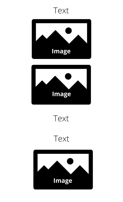
The above display will render perfectly on desktop. However in mobile, it will be displayed as follows
Layout Rendered on Mobile:
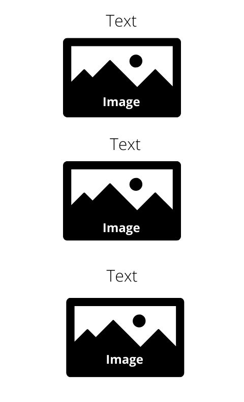
To solve this issue, it becomes necessary to reverse / change the column ordering for mobile so that Text and Image are displayed one after the other as per image given below
Layout On Mobile ( Required)
So how can you solve this issue?
Snippet To Change Column Order / Reverse Column Order on Mobile for Avada
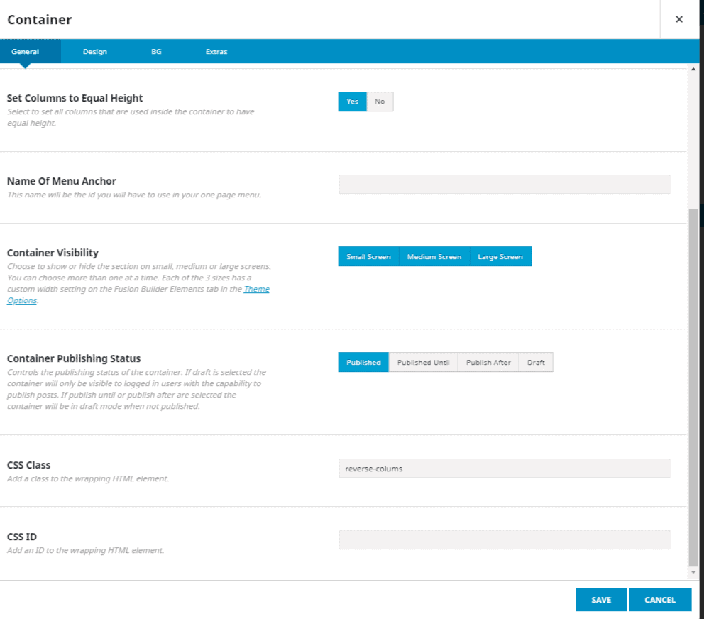
Snippet given below can help you reverse the column order on mobile for avada for the above mentioned use case. You can easily add it to Custom CSS section of Avada Theme Options and add the CSS Class declared (.reverse-columns ) in snippet to relevant container elements to get the desired result
@media all and (max-width:800px){
.reverse-columns .fusion-row {
display: flex;
flex-flow: wrap;
flex-direction: column-reverse;}}
Using this simple snippet you can easily change the order column on mobile and display your page properly on mobile. Once snippet is added, all you need to do is add reverse-columns to CSS Class of Container. Please note you don’t have to add . (dot) before reverse-columns. Just reverse-columns
I have worked extensively on Avada Theme as well as many other themes and page builders. In case you wish to design / develop your website, do contact me.


![[Video] How To Make Social Media Icons Sticky For Mobile](https://xenrion.com/wp-content/uploads/2020/04/whatsapp-768x512.jpg)
