
Mobile Menu on Desktop Site With Kadence Theme
Kadence is a widely popular WordPress theme known for its lightweight architecture and comprehensive functionality. It’s a favorite among many digital agencies, including ours, for creating efficient, high-performance websites. There are instances, however, where specific design requirements necessitate deviations from standard practices, such as displaying the mobile menu on desktop versions of a website.
One such scenario involves implementing a side mobile toggle for desktop viewers. This can be particularly useful for maintaining a consistent user experience or for specific stylistic choices. Here’s the simplest and easiest way to enable the mobile menu on a desktop using the Kadence theme:
Steps to Display Mobile Menu on Desktop in Kadence Theme
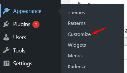
Navigate to Customizer:
- Go to your WordPress dashboard.
- Click on Appearance and then select Customize. This will open the theme customizer where you can modify various aspects of your theme.
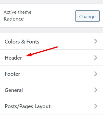
Adjust Header Settings:
- In the customizer, navigate to Header.
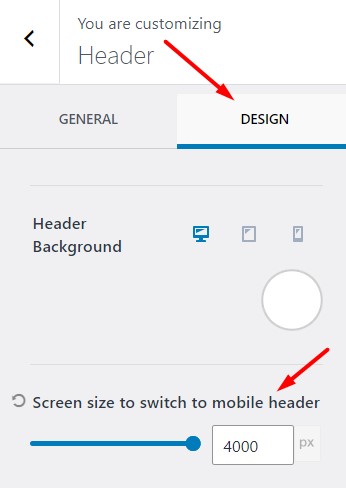
- Then proceed to the Design section.
Change the Breakpoint:
- Find the setting labeled Screen size to switch to mobile header.
- Change this value to 4000px. This setting alters the breakpoint at which your site switches from the desktop header to the mobile header, essentially forcing the mobile menu to appear on desktop screens.
By setting the breakpoint to 4000px, you ensure that the mobile header is used on all standard screen sizes, including desktops. It’s important to note that this change will disable the desktop header. Any further customizations or adjustments that you wish to make will need to be applied to the mobile header settings.This approach ensures that the mobile menu is consistently used across all devices, providing a unified user interface.

